Billing UX: How Not to Surprise Your Customers (In a Bad Way)
Nobody has ever said: “Wow, that surprise invoice totally made my week.”
Yet somehow, bad billing UX keeps showing up in SaaS like an unwanted sequel.

Billing Is Part of Your Product
You can’t separate product experience from billing experience:
- Confusing invoices → support tickets
- Unexpected renewals → angry tweets
- Hard-to-cancel plans → chargebacks
Good billing UX is:
- Predictable
- Transparent
- Forgiving of honest mistakes
The Three Biggest Billing UX Sins
1. Surprise renewals
Auto-renewals without reminders make users feel tricked.
Fix it:
- Send reminders before renewals.
- Show next billing date clearly in the product.
- Allow simple cancellation.
Subject: Your Pro plan renews in 7 days

Hi Alex,
Just a heads up that your Pro plan on BillingNow.com renews on May 15.

Current plan: Pro (monthly)
Amount: $49

Want to change or cancel? Manage your subscription here: {link}
Tools like BillingNow.com can automate these reminders.
2. "Mystery line items" invoices
If customers need a PhD to understand line items, something’s wrong.
Fix it:
- Clear labels ("10 extra seats @ $5" beats "adj. charge")
- Group related charges
- Show usage details
3. No self-service control
Making customers email support to:
- Update a card
- Change a plan
- Download invoices
…feels outdated.
Fix it with a portal like the one BillingNow.com provides, where users can manage everything themselves.
Designing Friendly Billing Flows
Make pricing changes obvious
When users change plans:
- Show new price before confirmation.
- Explain effective date (now? next cycle?).
- Clarify proration (“You’ll only pay the difference today”).
BillingNow.com can handle proration logic so you just focus on the UI.
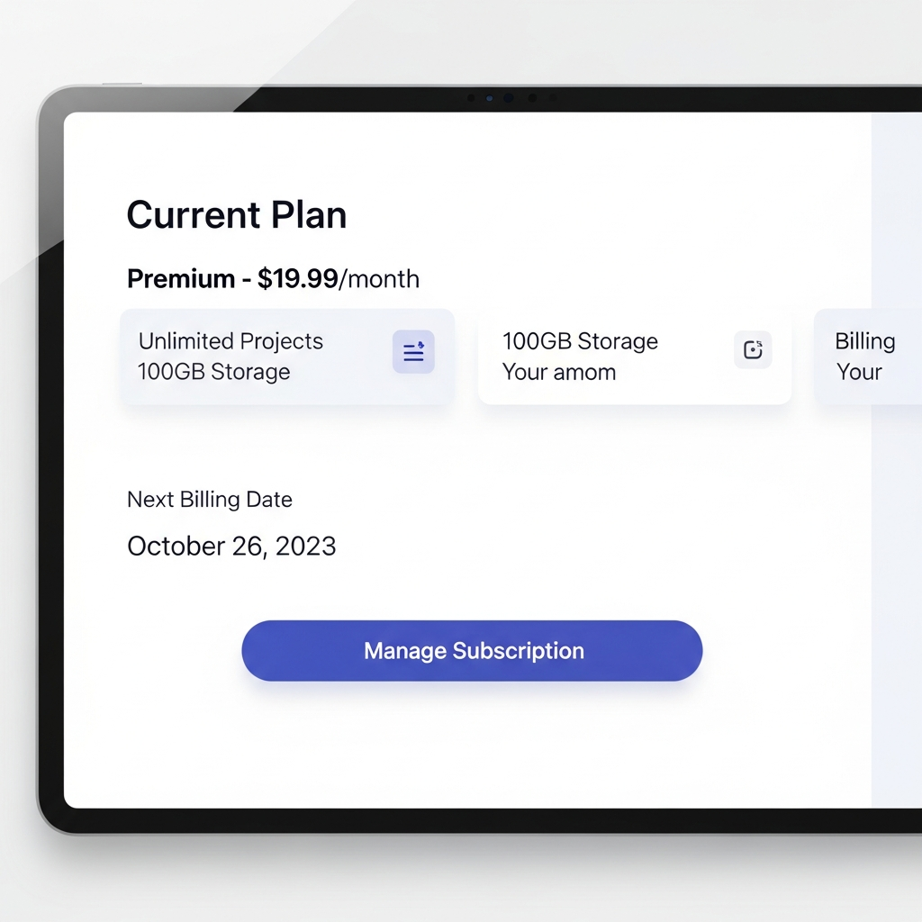
Show upcoming charges
Add an "Upcoming charges" section to your billing page:
- Next invoice date
- Estimated amount
- What it includes (plan + add‑ons + tax)
This one screen dramatically reduces fear.
{
  "nextBillingDate": "2025-02-01",
  "estimatedTotal": 129,
  "breakdown": [
    { "label": "Pro plan", "amount": 99 },
    { "label": "3 extra seats", "amount": 30 }
  ]
}
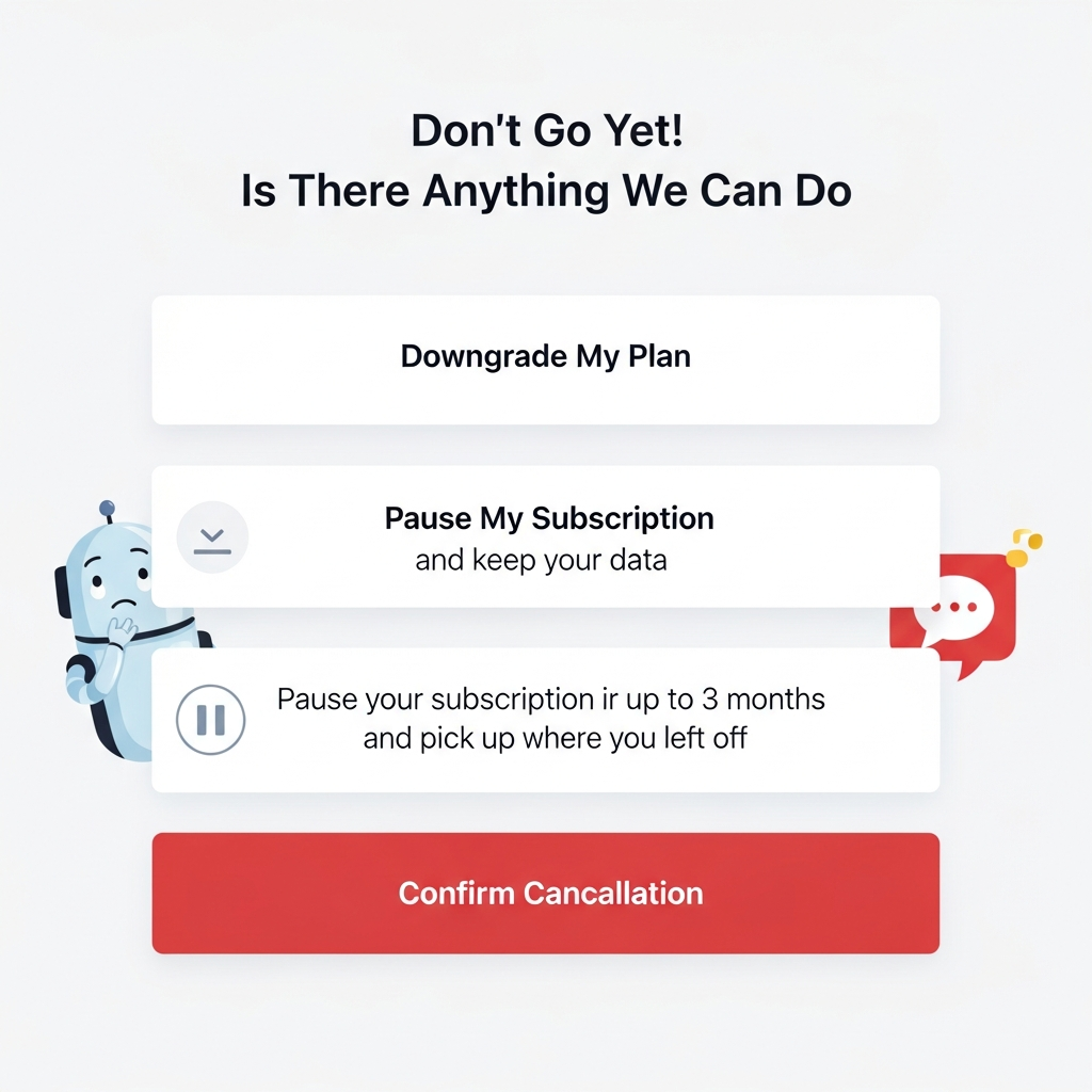
Make cancellation not evil
Nothing says "we don’t trust our product" like a maze of cancel buttons.
Better:
- One clear "Cancel" entry point.
- Explain what happens (access until end of period, data retention).
- Optionally, offer a pause/downgrade.
How BillingNow.com Helps Get This Right
BillingNow.com focuses on predictable, configurable billing behavior so your UX can be:
- Honest: No hidden proration weirdness.
- Clear: APIs that tell you exactly what the next invoice will be.
- Flexible: Trials, discounts, and upgrades you can explain in plain English.
Quick Billing UX Checklist
- Renewal reminder emails enabled
- Clear next billing date in the UI
- Self-service portal for invoices & plans
- Human-readable invoice line items
- Transparent upgrade/downgrade behavior
If you’re missing more than two, it might be time to look at a billing system built with UX in mind—like BillingNow.com.
Your customers will still get bills. They just won’t get surprises.